Everyone is focused on building a long email list by offering various lead magnets and other offerings.
But building an email list won't get you conversions. It's only a database of people interested in hearing from you.
So, if someone signed up for your emails, show them that you appreciate them by sending a friendly welcome email. It will get you more open and create a good first impression.
Table of contents
How to create a compelling welcome email series
- Lead with personalization
- Send welcome emails from a person- not a business
- Always end your emails with an action
- Write a clear subject line
- Use an emoji in your email subject lines
- Welcome email series example
- Email 1: Thank you, email
- Email 2: Share your story and values
- Email 3: Ask about their preferences
- Email 4: Share social proof to boost trust
8 welcome email examples from our inbox (+templates)
- 1. Share your brand story
- 2. Add a personal note in your welcome emails
- 3. Share a coupon code with new subscribers
- 4. Welcome and share useful resources
- 5. Give an overview of your product's features
- 6. Talk about what they can expect and collect preferences
- 7. Welcome new free trial users
- 8. GIFs in welcome emails by Invision
What are welcome emails?
Welcome emails are sent after a new user signs up for your email list. It can be when they download a lead magnet, create a free trial account, or sign up for your monthly newsletter.
The goal of welcome emails includes:
Thanking new users for connecting with your brand.
Making them familiar with your product or services.
Engaging with new subscribers and nurturing them to build trust and credibility.
These emails are your window to take new subscribers on an adventure journey, including sharing your story, value, products/services with them, and kickstarting a relationship.
Why should you send welcome emails?
Welcome emails present a wealth of opportunities, from improving your email metrics to building a strong foundation with your new subscribers.
Here are some of the major benefits you will see vis welcome emails
• Subscribers expect a welcome email
If someone has signed up for your newsletter, it shows their interest in it. And you need to acknowledge their interest by sending them a welcome email. They can lose interest if they don't get a welcome email within a few minutes of signing up.
I know how often I have wondered why they didn't send me a welcome email. That sucks, and it might be the same for your audience.
• Higher open and click rates
A user who signs up with your brand reflects their intent to buy. They have shown interest, and brands, especially ecommerce, can leverage this by sending a discount coupon code in their welcome email.
As per Bluecore 2022 Benchmark report, welcome email has the highest open and click rate of 46.72% and 11.27% respectively compared to other emails such as an abandoned cart, back in stock, etc.
• Brings in more conversions
Besides getting more opens and clicks, welcome emails are the most successful in generating more conversions. If users have already opened and clicked, your email successfully grabbed their attention and kept them engaged. So, at this stage, their buying intent is considerably higher, which can lead to higher conversions.
In fact, Benchmark report 2022 also reveals that these emails have a conversion rate of 2.20%.
How to create a compelling welcome email series
Yes, you have created a great first impression, but a single email won't suffice to create a lasting impression.
You need a series of emails to welcome users, make them comfortable with your brand and let them explore.
But, before moving on to the series, you need to know what constitutes a good welcome email.
Lead with personalization
A welcome email is your chance to get in the good books of the subscribers, and what's another way to make it about them? Yes, use personalization by referring to them by their name or sharing a relevant story to let them connect with you.
Send welcome emails from a person- not a business
To stand out in your subscriber's inbox, use a person's name as the sender and add an image of that person. It works for two reasons:
It catches subscriber's attention in their already crowded inbox
Since it's coming from a person, it seems more personal. People tend to open emails from a person more.
Always end your emails with an action
If someone signups up for your emails, it means you've got their attention. Don't let that attention dye.
If you send a newsletter welcome email, ask them to reply with the type of content they want you to talk about
If someone signups up for a free trial, ask them the pain points they're trying to solve and use this data to curate better email content.
Write a clear subject line
Your welcome email subject line needs to capture the subscriber's attention only when they open and see the good stuff inside. It should tell them that it's a welcome email, give them a reason to open it and stand out in the recipient's inbox.
Here are some of the good subject lines you can steal:
We are so happy you signed up (emoji)
I'm thrilled to have you onboard [Person's name]
Welcome to our team [Person's name]
Thank you for subscribing. Here's what we have in store for you
A special welcome 🎁 gift for you.
[Person's name], we have many goodies for our new subscribers.
Use an emoji in your email subject lines
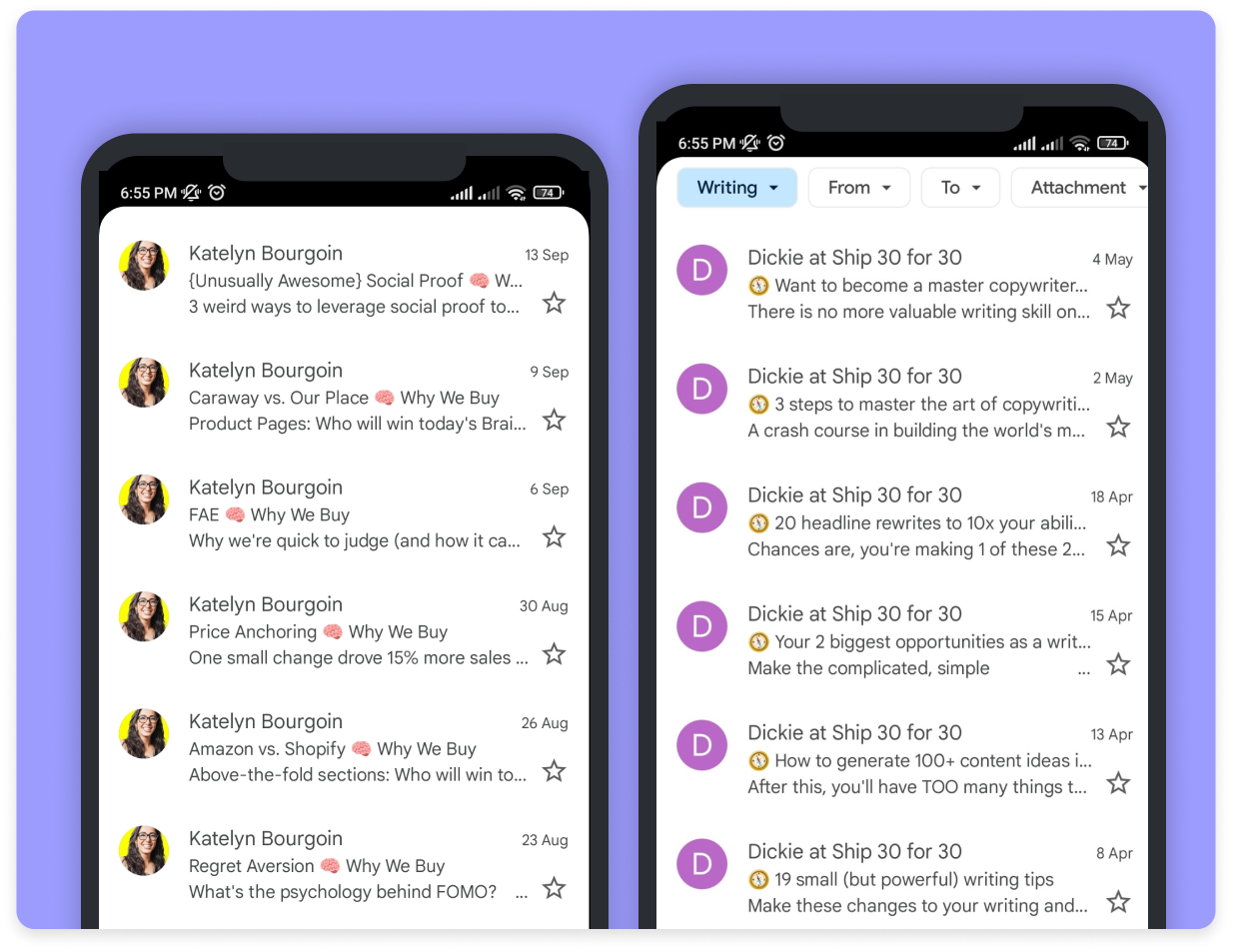
People tend to engage and connect more with things that seem familiar. So, try adding an emoji in your subject line for all the emails and see how it impacts your email metrics.
Adding an emoji makes your email different from other emails, and it ingrains your brand/individual identity in their mind.
Here are two good examples of emojis to create a brand identity within the recipient's inbox.
When to send welcome emails?
You should send a welcome email within a few minutes of signing up. It's because you are still active in the user's brain, and an immediate email will get them to open your email and compel them to take action, be it asking for a reply or moving your emails to their primary inbox. It boosts the open rate and gives a positive signal to ISPs, further enhancing your deliverability rate.
How many welcome emails should you send?
We recommend sending at least 3-4 welcome emails that give an overview of your brand and build credibility and trust.
Welcome email series example
Here's a hypothetical welcome email series example for when someone signups for your company's newsletter:
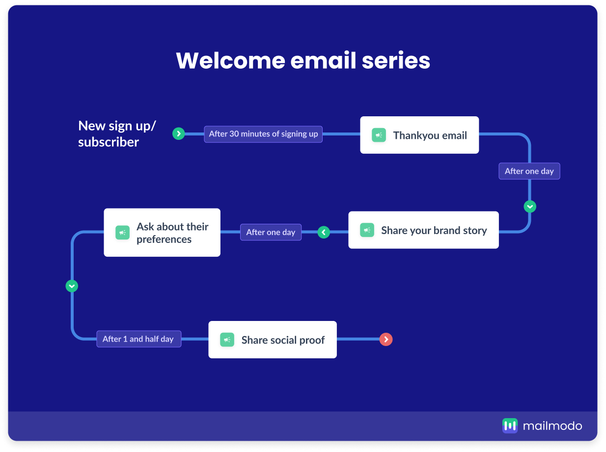
Email 1: Thank you, email
Welcome new subscribers by thanking them for signing up. In this email, you can give an overview of what the recipient can expect over the next few days, how many emails you will send, etc.
Also, ask them to add your emails to their contact list so that your emails land in their inbox every time.
Leave with a CTA. Often it's about asking them to hit reply or check out some of your archives.
Email 2: Share your story and values
Send this email the next day of the welcome email. The aim is to give users an overview of where you come from, what you stand for, and what you want to achieve.
Email 3: Ask about their preferences
This email is about getting to know your subscribers better. You can ask them to share their preference by replying to your email or create a preference center and lead them there.
One other and frictionless way to collect your user's preference is to embed an AMP email form inside the email, which will look like this:
Using AMP email forms gives them a chance to fill in their preferences without going to a new tab. This form eliminates the friction in the submission process and creates a hassle-free customer experience.
Email 4: Share social proof to boost trust
Talk about what other subscribers are saying about your brand's newsletter. Add screenshots and customer testimonials and, if possible, add those people's images to create a connection.
Remember that this is one of many possible welcome emails flows you can build. This is an example to give you an idea of how to create one.
Here are some of the other themes we've seen in the welcome email that's all your now:
Ask new subscribers to refer to their friends, peers, or family members
Ask them to download your app by displaying the benefits they will get
Nudge them to engage with you on social by showing some of your best campaigns
Convince them to become a premium customer
Ask them to join your loyalty program
Ask them to check out your resource center
Also, get a sneak peek into these our SaaS email flows here 👇🏼
8 welcome email examples from our inbox (+templates)
Here is a list of some of the best welcome emails from our inbox.
1. Share your brand story

Fortnum and Mason's welcome email is nothing but a treat to the reader's eye and a lullaby to their ears. The copy is inviting and reflects the effort and time the writer has invested in writing it. They began by sharing an image of their brand and telling their story.
✨ Why did we like this email?
Consistent brand color
Appealing imagery
Inviting and playful language
Prominent call-to-actions
Something to look forward to "in the next issue
2. Add a personal note in your welcome emails
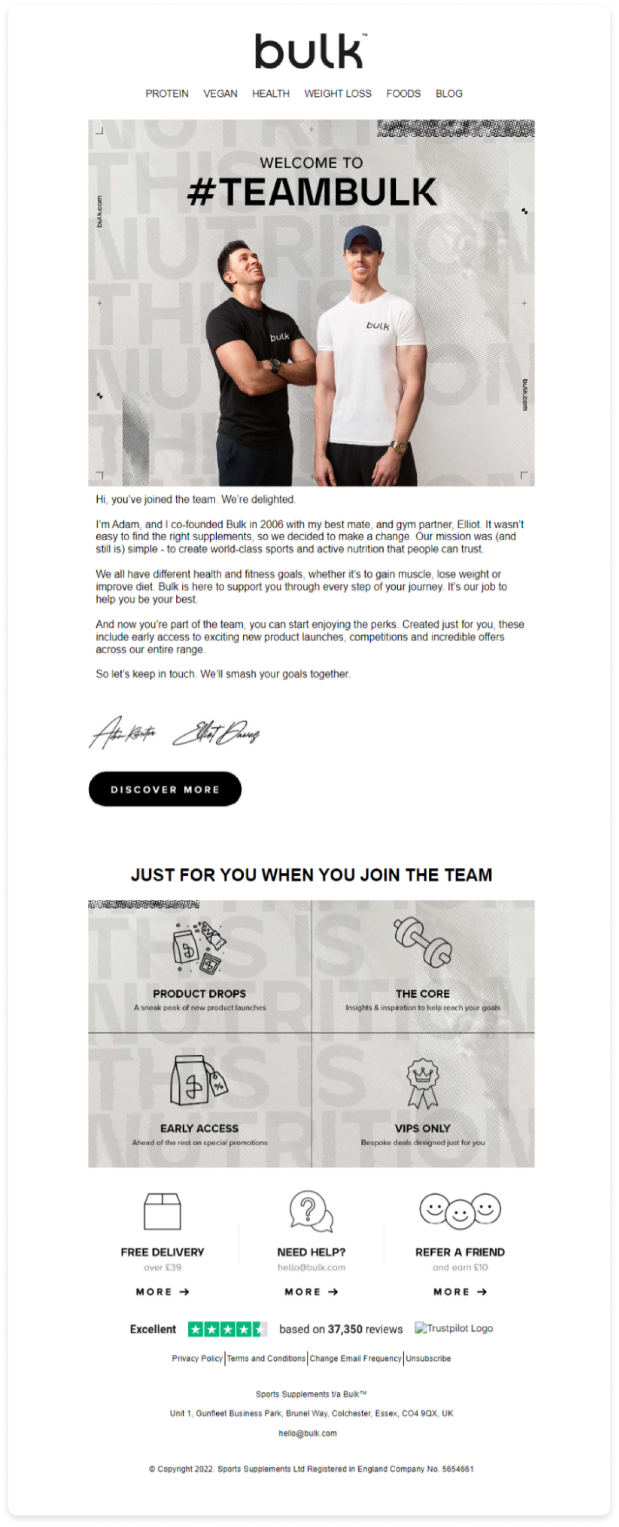
The pictures of the founder and co-founder and a personal note from us grabbed our attention. Not only does it build an instant connection with the inclusion of the images, but it also feels more human.
Furthermore, categorizing what's included if they join an overview to the reader.
✨ What we liked about this email?
Single-column layout making it easy to read
Color scheme is consistent with the brand
Social proof towards the end
A single ad prominent call-to-action
3. Share a coupon code with new subscribers

This email tells subscribers what they can expect from REI emails and nudges them to manage their preferences. This will do two things: One, it can reduce the unsubscribe rate by asking users to choose emails they really want; secondly, it will create a positive brand image that you care about the subscriber's privacy.
Another major highlight is they share a special discount for the new users, which is a great tactic to bring conversions.
✨ Why did we choose this email?
Contrasting color scheme
Header image gives a playful vibe
Small section with their respective CTAs
Even though the email looks good overall, I think I would change the first two CTAs to lead users to the same page. So, instead of having two CTAs there, one would suffice. It will reduce the number of CTAs and avoid confusion as the first two CTA and copy in those sections point to the same action.
4. Welcome and share useful resources
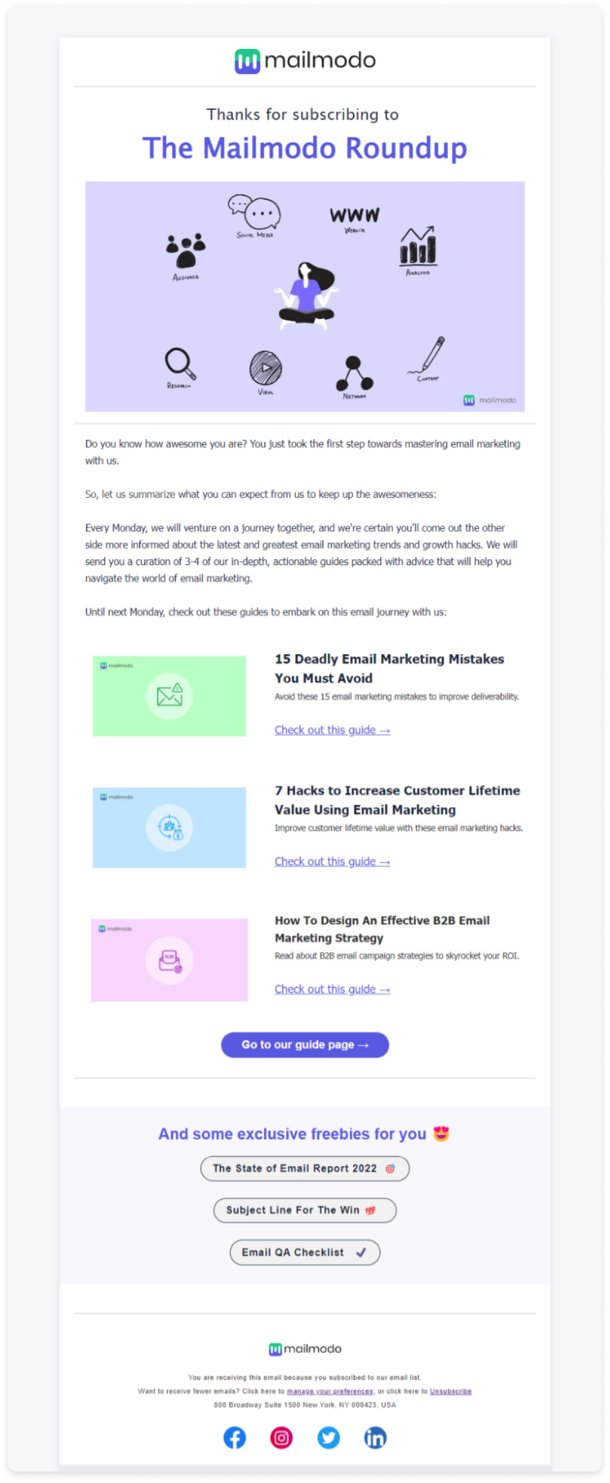
Customize this newsletter welcome email
In the B2B space, you can share useful resources if someone signups up for your brand newsletter. This will show your work to them, and it can also help them learn more about your industry.
✨ Why does this email template work?
SIngle-column left-signed layout
Minimal light color theme
Clear call-to-action
Exclusive freebies making them feel special
5. Give an overview of your product's features

Check out this B2B welcome email
An overview of your product's features is one of the best ways to hook new users and nudge them to try it immediately. I have seen many B2B SaaS welcome emails talking about their product and which feature to try first. So, use these tactics in your welcome email to familiarize new users with your product/services.
✨ Why use this welcome email template?
Interactive AMP email form
Color scheme is consistent with the brand
Visual imagery gives a sneak peek into the product
Clear call-to-action
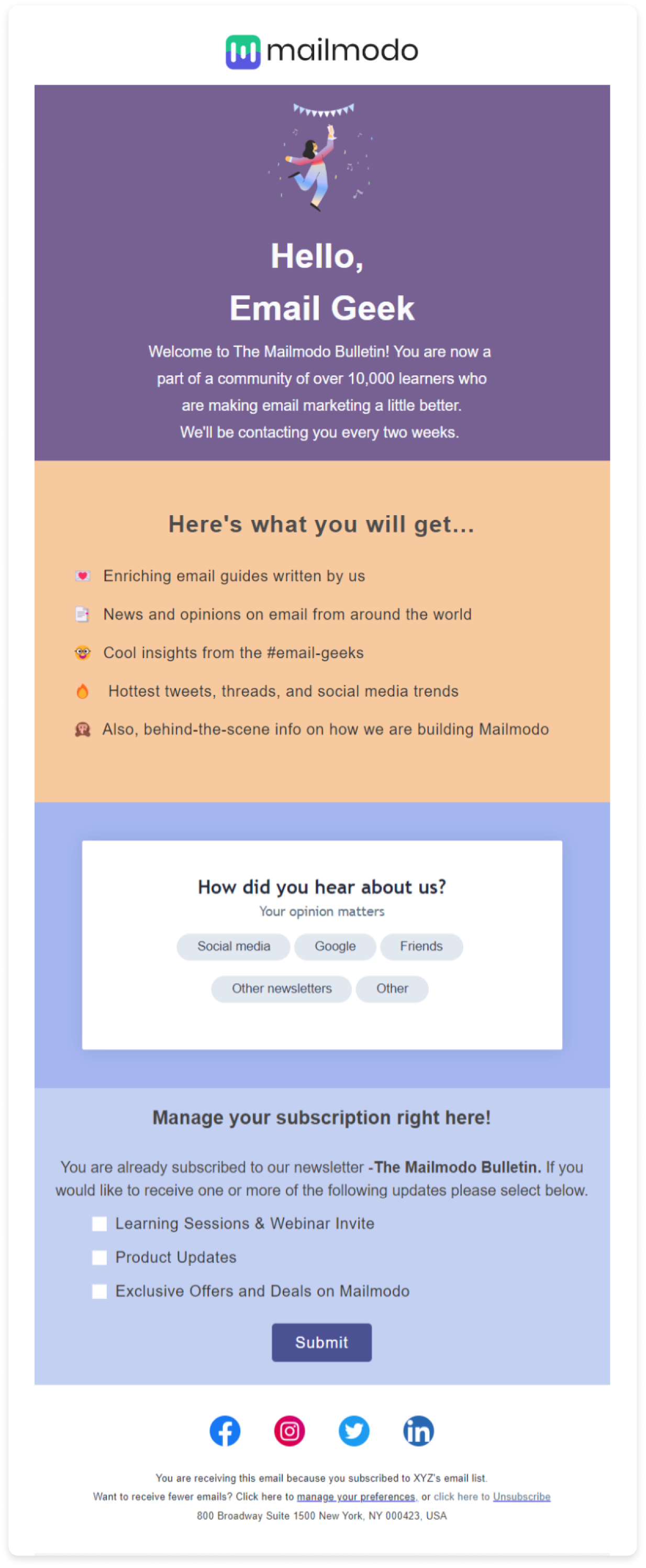
6. Talk about what they can expect and collect preferences
Customize this subscription confirmation email
What catches attention in this email is the color-wise division of sections that talk about a specific thing. The first section welcomes users, and the second briefly explains what the future email will contain.
The last two sections are made interactive using AMP for email so that users can give answers without leaving their inboxes. This email is also a good example of collecting subscribers' feedback and references to send them more target emails in the future.
✨ What's so good about this email?
Color-wise section create a proper flow
Interactive widgets
Consistent brand colors
Clear CTA
7. Welcome new free trial users
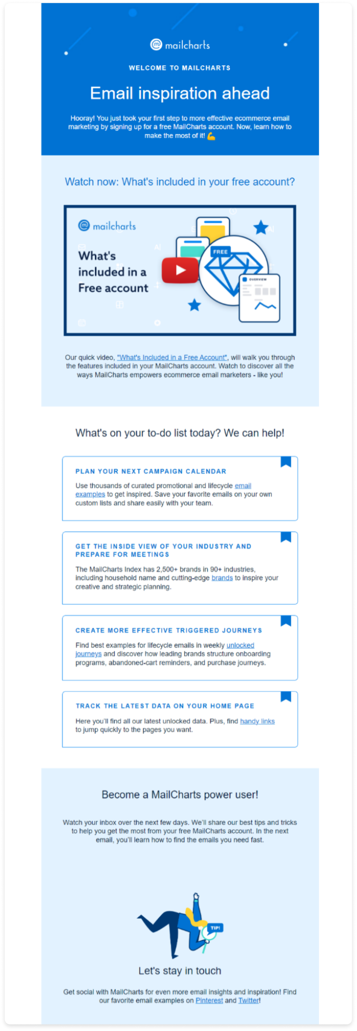
Mailcharts email is a good example of a B2B welcome email as they use a text-heavy approach to welcome users and give them an overview of what they can do with their product. They've also embedded a video at the top to direct users to see how their product works in real time.
Why did we choose this email?
Clean and single-column layout
Text-heavy email with the right formatting
Monochromatic color scheme
8. GIFs in welcome emails by Invision
Here's a unique welcome email by Invision where they talk about how people are using their product and showcase their product in action via GIF. Other than that, they nudge readers to check out their tool and remove friction by mentioning how long it will take to experience it. Clever!
✨ Why did we like this email?
GIF giving an overview of the product
Minimal email design look
Short and crisp email copy
Clear call to action
Want inspiration for your welcome emails? Check out our template library of 200+ emails fully customizable and loads of interactive widgets to choose from.
Why do welcome emails have higher unsubscribes?
We mentioned that welcome emails have the highest open and engagement rate. But, they also have a higher unsubscribe rate. As per Mailjet's data, these emails have an unsubscribe rate of 8.80% higher than any other type of email campaign.
The major reason is users who have signed up to get exclusive deals or incentives might not be interested in receiving your emails. They are interested in getting that deal. So, they'll unsubscribe after your email has served their intent for signing up.
On one side, this is a good thing as you want only the most interested people in your email list to maintain the email list hygiene. So, if users are unsubscribing, it reflects that they weren't interested in your emails.
But you shouldn't just let these users go without even trying. You can offer them exclusive deals or show product recommendations to give them a reason to stay. But, keep only those users with higher intent to be on your email list.
Best practices for welcome email campaigns
You will benefit from welcome emails only if you follow the best practices. Some of the best practices we recommend are as follows:
• Ask your subscribers to reply to your welcome emails
Because it sends a strong signal to ISPs that your recipient trusts you and helps improve inbox placement rate.
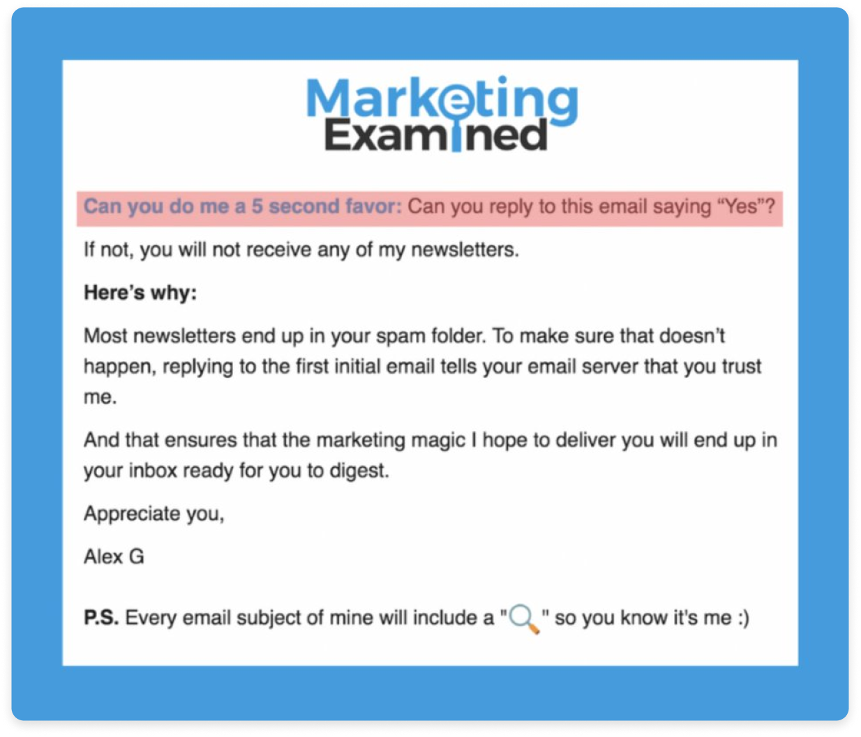
Here's an example of a welcome email by Alex Gracia and how he gives the recipient a reason behind asking for a reply from them.
• Nudge them to checkout relevant products or services
If a person signed up for your marketing email, then have a category section to let them check out other related categories too. It will help in cross-selling. You can also use this data to analyze their interest and use that data to send more targeted emails in the future.
Here's an example by the BBC and how they use the category section to let people choose TV shows based on their preferences.
• Analyze acquisition channel data to send target welcome email
Users will join your email list through different channels, a social media campaign or a lead magnet. Based on the source of acquisition, you can send different themed welcome emails to create a better experience for them.
For example, someone who signups up via social media ads might not need a CTA to follow you on social while those who downloaded a lead might need that CTA.
Understand that each user is coming from a different channel and how you can use that to create a unique welcome experience for them.
• Seasonally analyze and update your welcome emails
Don't sleep on your welcome email campaigns. It's not a one-off campaign that you create and forget. New users will keep joining the email list, and emails that, once worked, might not work again in the coming future. So, always look for email design and marketing trends to bring something new to your welcome emails and stay relevant.
Way forward
You never get to make the first impression again, so make it worthwhile by sending them compelling and personalized welcome emails. Put your heart into your welcome emails and make the recipient feel special.
The next step in the nurturing journey can be to keep them informed about what's happening within the industry or with your brand. So, send them relevant and necessary product updates and promotional emails to stay on top of their mind.


